Introduction
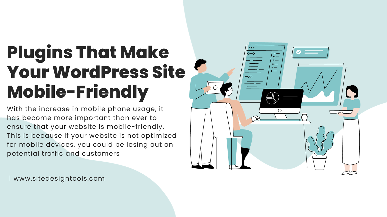
With the increase in mobile phone usage, it has become more important than ever to ensure that your website is mobile-friendly. This is because if your website is not optimized for mobile devices, you could be losing out on potential traffic and customers. WordPress is a great platform to build your website on, but you need to make sure that your site is optimized for mobile devices, as this will provide optimal viewing and functionality. Luckily, there are several plugins available that can help you achieve this. In this article, we will explore some of the best plugins available for you to use on your WordPress site to make it mobile-friendly.
Wp Touch
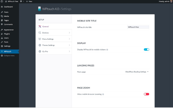
WPtouch is one of the most popular plugins for ensuring that your WordPress site is mobile-friendly. This plugin adds a simple and elegant mobile theme to your site, which allows mobile visitors to easily access your content. The plugin also provides you with several customization options, including the ability to control the color scheme, font size, and layout of your mobile site.
Jet Pack
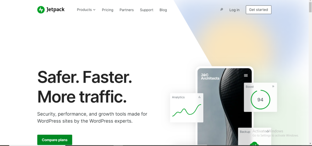
JetPack is another popular plugin that provides mobile-friendly features to your WordPress site. This plugin comes packed with several features, including a mobile theme that is optimized for mobile devices, allowing your site to look great on smartphones and tablets. The plugin also includes several optimization features, including Lazy Load, which loads images as the user scrolls down the page, and Photon, which speeds up your site by serving images from WordPress.com.
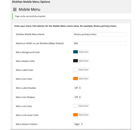
Wp Mobile Menu
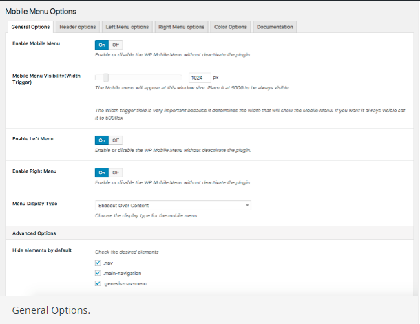
WP Mobile Menu is a basic mobile menu plugin that adds a responsive menu to your WordPress site. This plugin makes it easy for mobile visitors to navigate your site on smaller screens. This plugin provides you with a simple and easy-to-use interface, making it easy to set up and customize your mobile menu. The plugin also includes several features, including the ability to add icons to your menu items, choose your own color scheme, and set custom logo and menu descriptions.
Mobile Menu
Mobile Menu is another popular mobile menu plugin that provides a responsive menu for your WordPress site. This plugin is optimized for small screens, allowing easy navigation on mobile devices. The plugin also offers a number of customization options, including the ability to set the size and color of your menu items, and to customize the appearance of your menu button.
Conclusion
Having a mobile-friendly website is a must if you want to reach and engage with mobile users. With the plugins listed above, you can easily optimize your WordPress site and ensure that it is optimized for mobile devices. Whether you are looking for a mobile theme, mobile menu, or other mobile optimization features, there are plenty of great plugins available to help you create a mobile-friendly site. So, take the time to explore these plugins and find the ones that work best for your site. With just a few simple optimizations, you can create a mobile-friendly site that is optimized for both mobile and desktop users.